Savicki is a distinguished luxury jewelry brand renowned for its exquisite selection of engagement rings, wedding bands, and high-end jewelry. Their online platform offering an array of carefully crafted jewelry pieces, each designed to reflect sophistication and timeless beauty.
MY ROLE UX/UI Designer
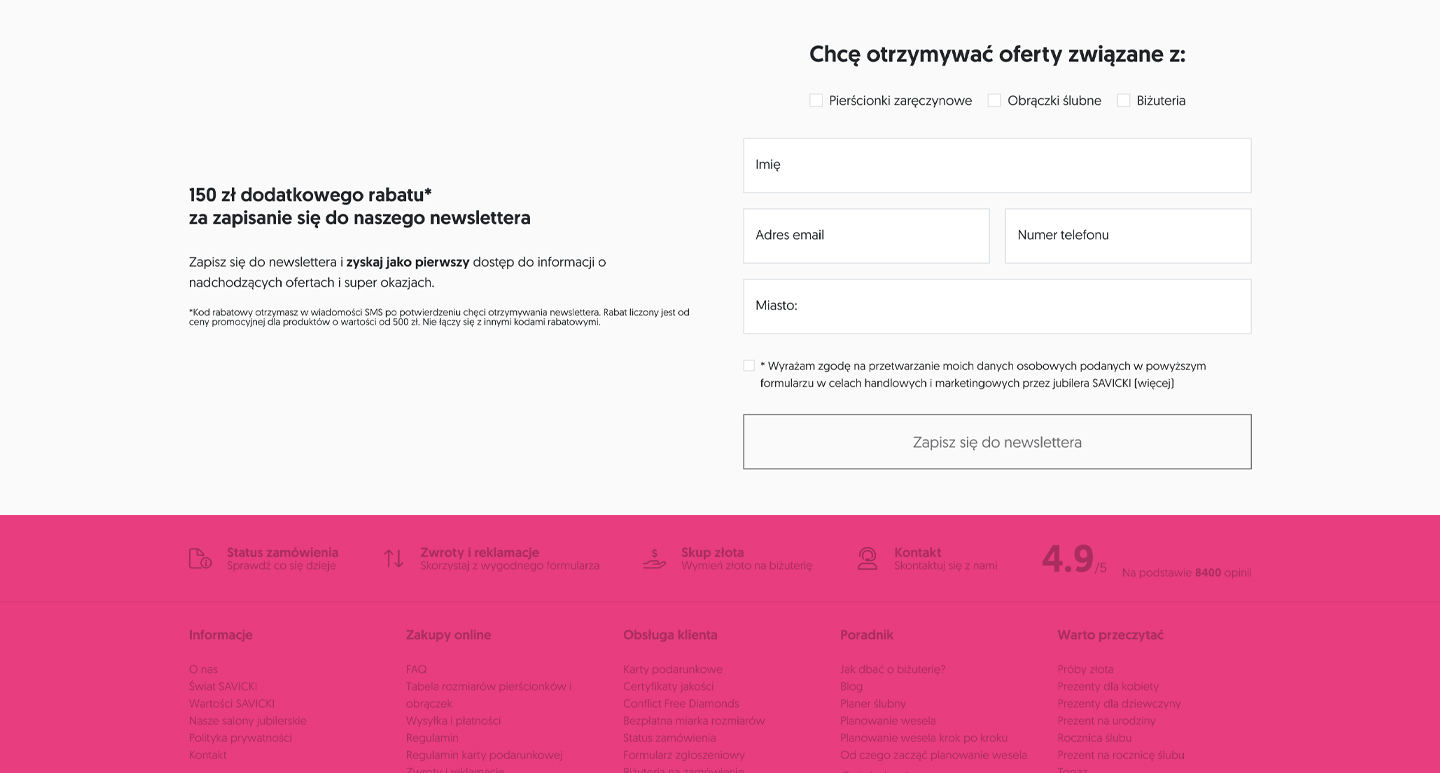
PROBLEM The UI design and functionality of the newsletter signup form were outdated, while the information architecture confused users and could have impacted conversion rates. The organization decided to update the section and create a more engaging form.
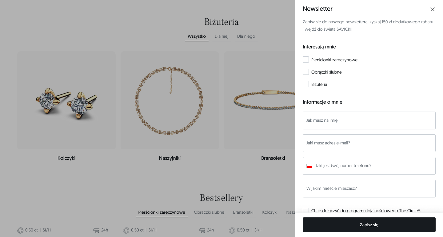
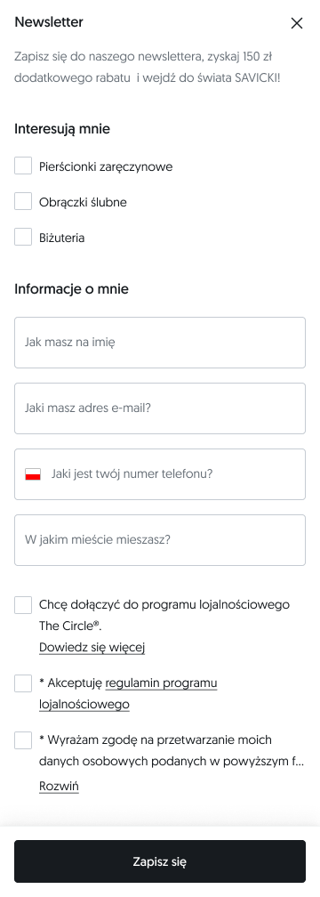
DISCOVERY PHASE The form was created for users who wanted to receive a promo code for online and in-store purchases or stay up to date with offers. The business needed to collect more user data than just an email address to create more personalized offers and messages. The old form was overloaded and felt overwhelming at the beginning due to the amount of data and fields to fill out.
DESIGN PROCESS 1. Interviews with internal stakeholders – company management and E-commerce Manager. 2. Analysis and observation of user behavior—whether they were able to complete the form, when they decided to abandon it, and what types of problems or errors they encountered while signing up for the newsletter. 3. Design based on information architecture and Design System. Alignment of UX solutions with business objectives. 4.Usability testing and design fixes.
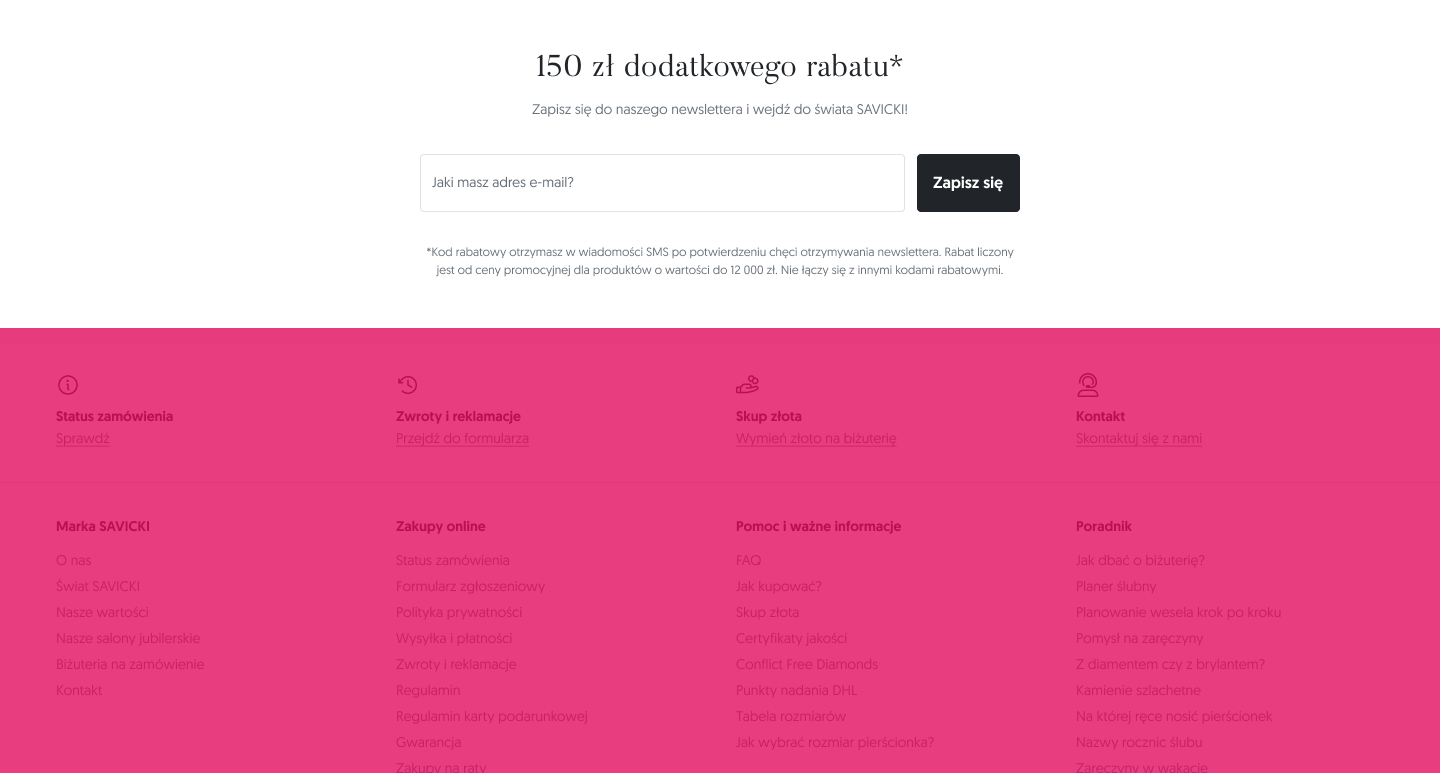
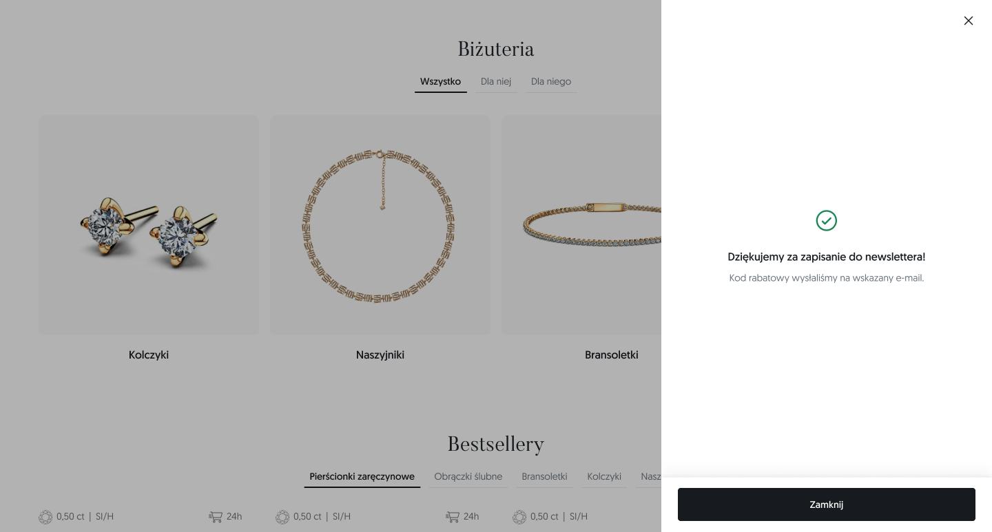
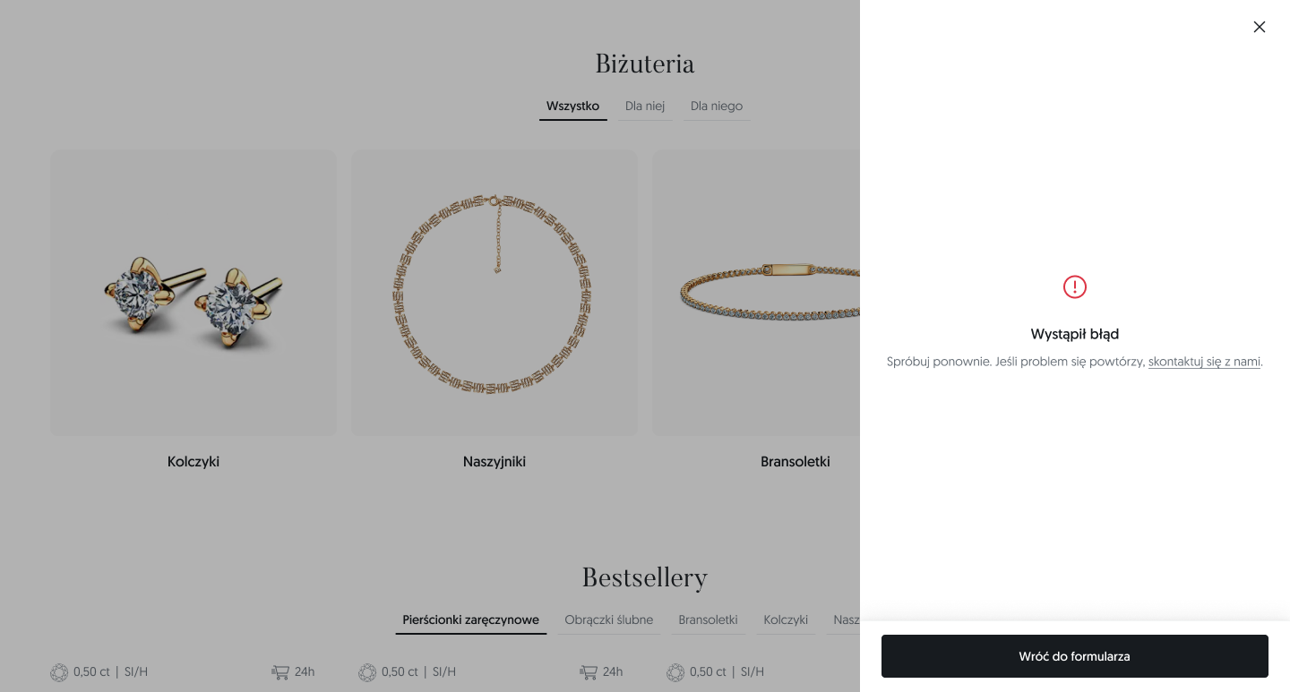
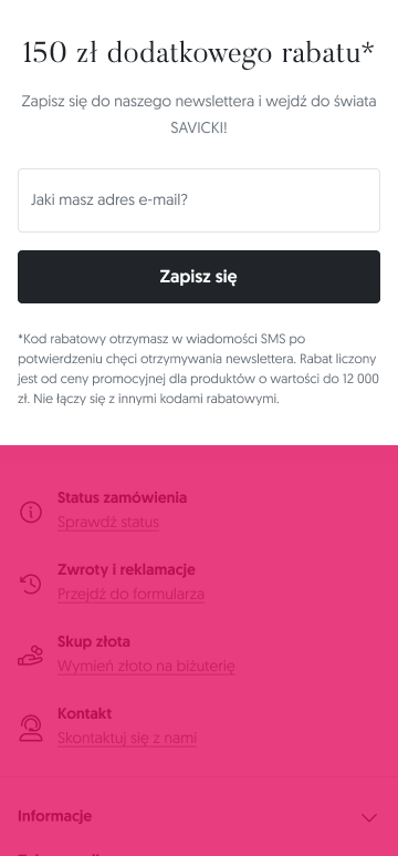
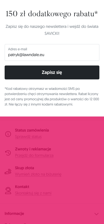
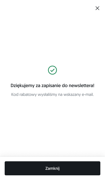
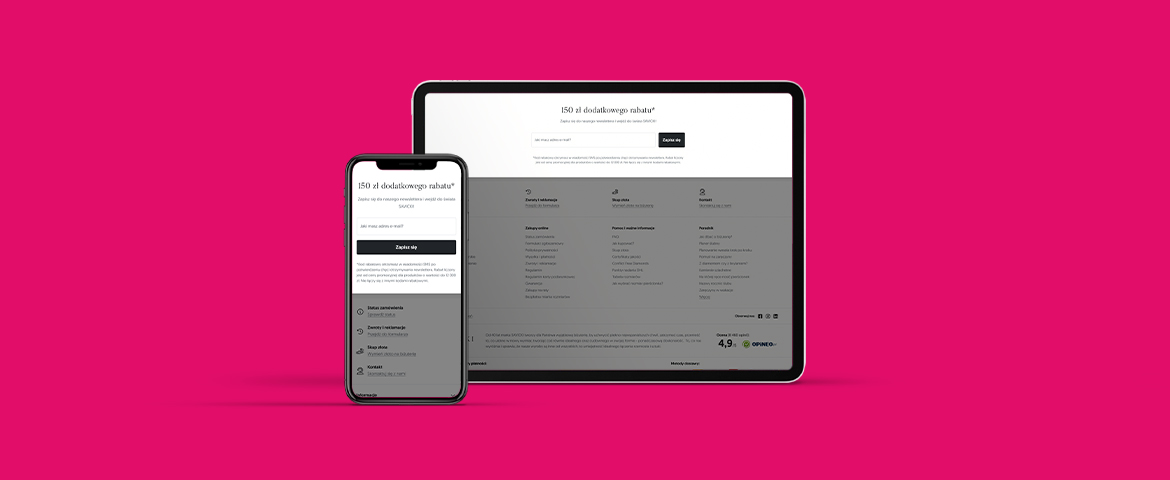
SOLUTION Users enticed by a discount offer would leave their email address in exchange for a promo code. However, the business needed to gather more data to better tailor offers for potential clients. Inputs other than the email address were hidden in an off-canvas panel to avoid discouraging users at first glance. Research showed that this approach increased form conversion by 30%, as users, focused on their goal, were more willing to provide additional information when they perceived it as a necessary step to claim their discount.