Savicki is a distinguished luxury jewelry brand renowned for its exquisite selection of engagement rings, wedding bands, and high-end jewelry. Their online platform offering an array of carefully crafted jewelry pieces, each designed to reflect sophistication and timeless beauty.
MY ROLE I led UX/UI redesign of the product listing – from problem analysis to concept and testable prototypes.
PROBLEM The old listing page was outdated and unintuitive. It lacked a clear information architecture, and confused users with misleading pricing. There was also a lack of inspiration and exploration tools, which are crucial in categories like jewelry.
DISCOVERY PHASE 1. I identified the key pain points: lack of clear structure, scattered filters (especially the store filter being placed too low, which contradicted the omnichannel strategy), misleading pricing, and missing exploratory elements. 2. I collected both qualitative and quantitative data: Google Analytics, heatmap analysis, Session recordings, competitive benchmarking. 3. I conducted workshops with stakeholders (e-commerce, marketing, retail).
DESIGN PROCESS I iterated over multiple layout variants and tested them with users. My focus was on: 1. Creating a clearer hierarchy and navigation. 2. Prioritizing elements that influence purchase decisions. 3. Emphasizing inspiration and discovery. 4. Enlarging the product presentation area
SOLUTION The new listing experience introduced several key enhancements:
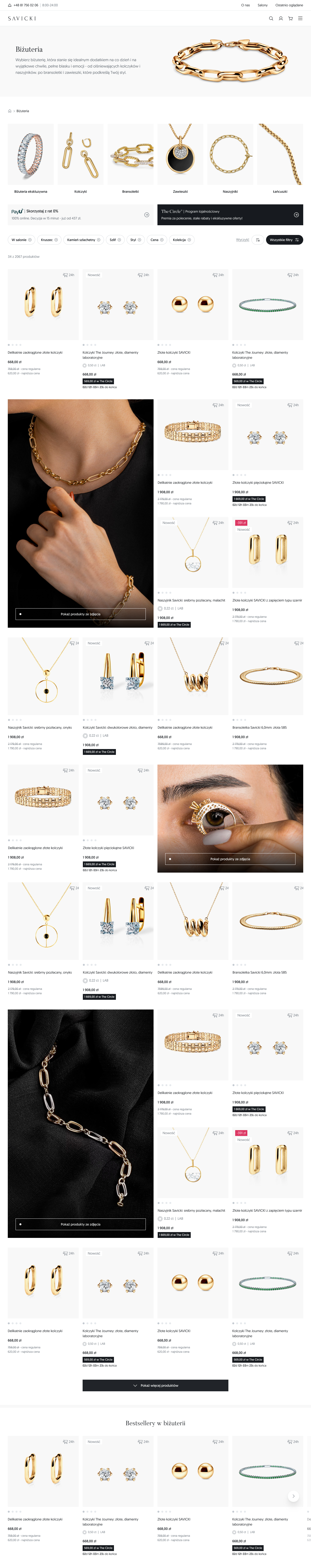
Structure & Discovery 1. Hero section with title, image, and a short category description. 2. Breadcrumb navigation for orientation within the site. 3. Category tiles leading to subcategories. 4. Product cards with an improved layout and clearer information hierarchy. 5. Dedicated space for promotional and informational content. 6. Bestseller carousel to support product discovery.
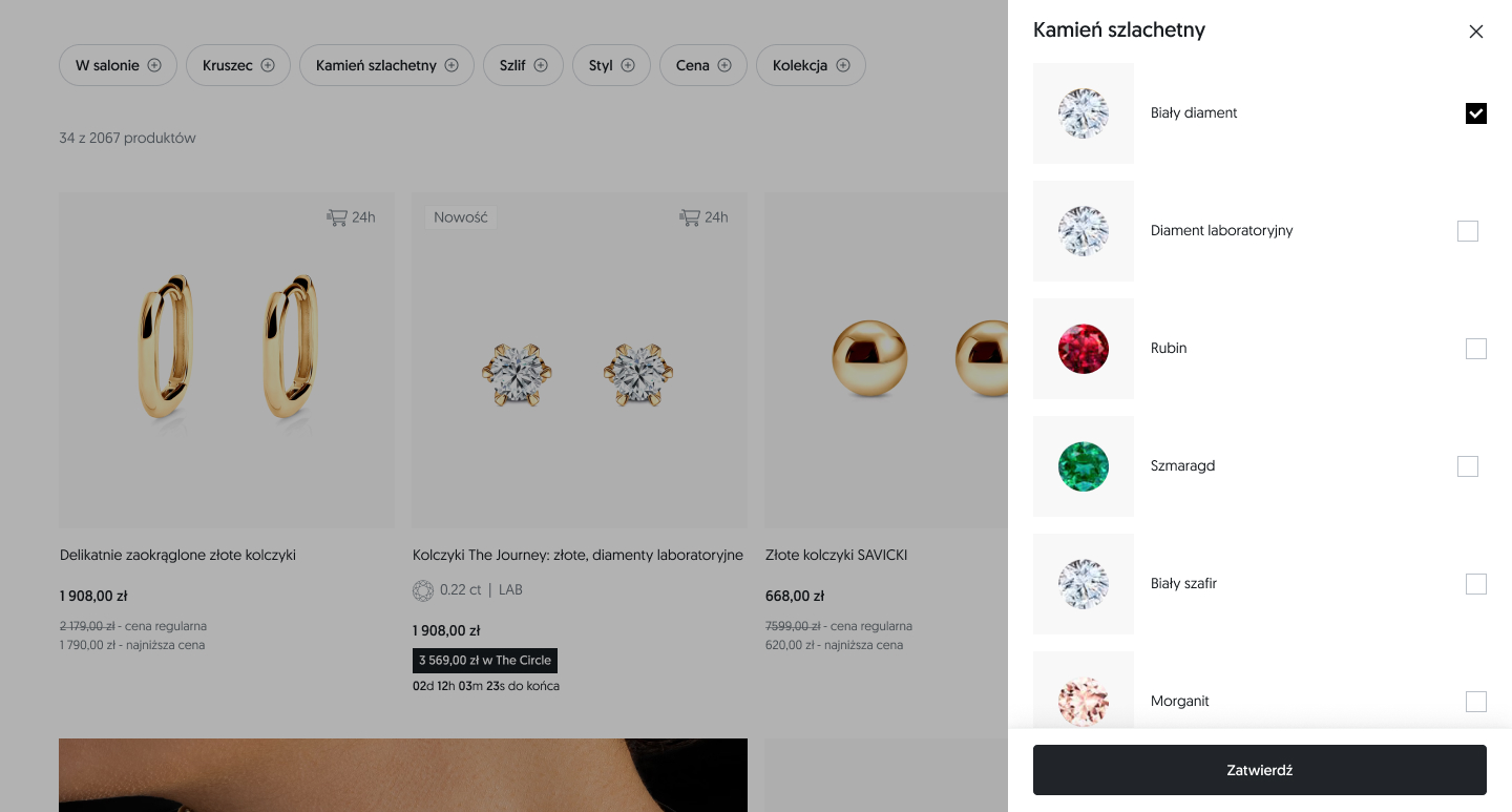
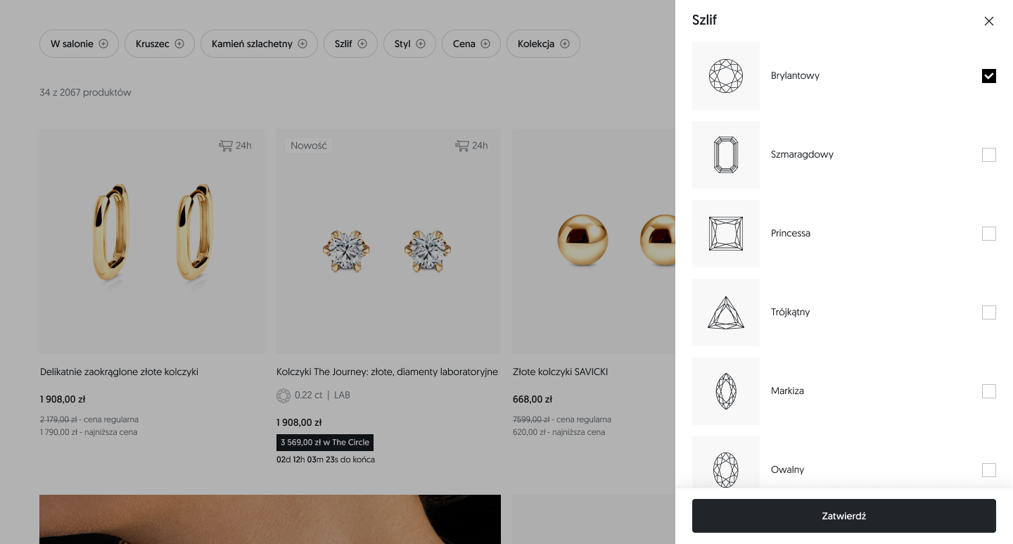
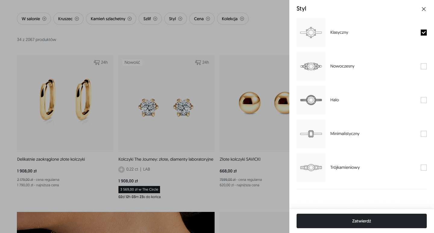
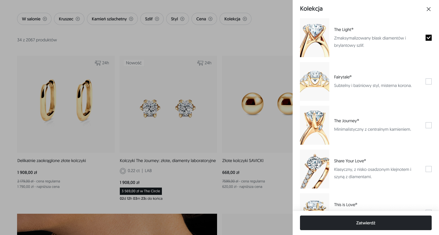
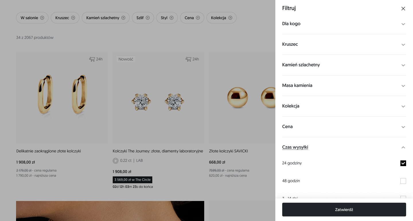
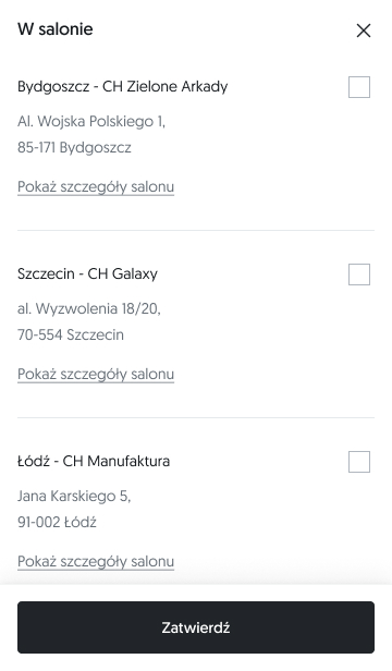
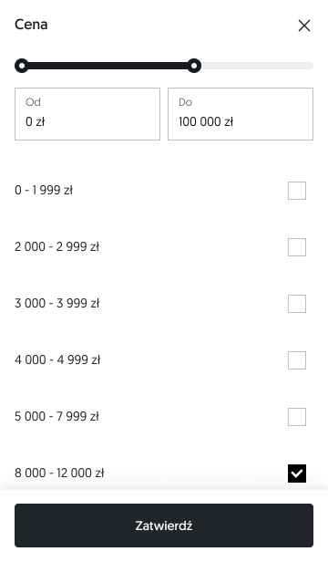
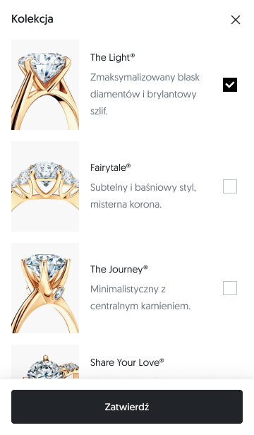
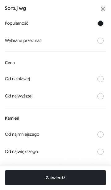
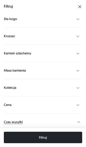
Filtering & Omnichannel 1. Key filters highlighted – with the store filter placed first to support omnichannel. 2. Filters moved to off-canvas to maximize product visibility. 3. End-of-results message with quick filter reset option.
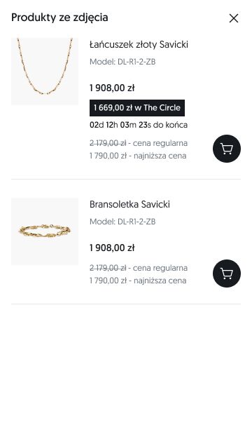
Product box 1. Refined layout, promotional flags, and clear details on carat weight and diamond type (natural or lab-grown). 2. Streamlined picing layout with a premium look & feel. 3. Loyalty price with a countdown timer (visible on selected offers only). 4. Hover state with detail/lifestyle image for desktop. 5. Swipeable image carousel for mobile and tablet.
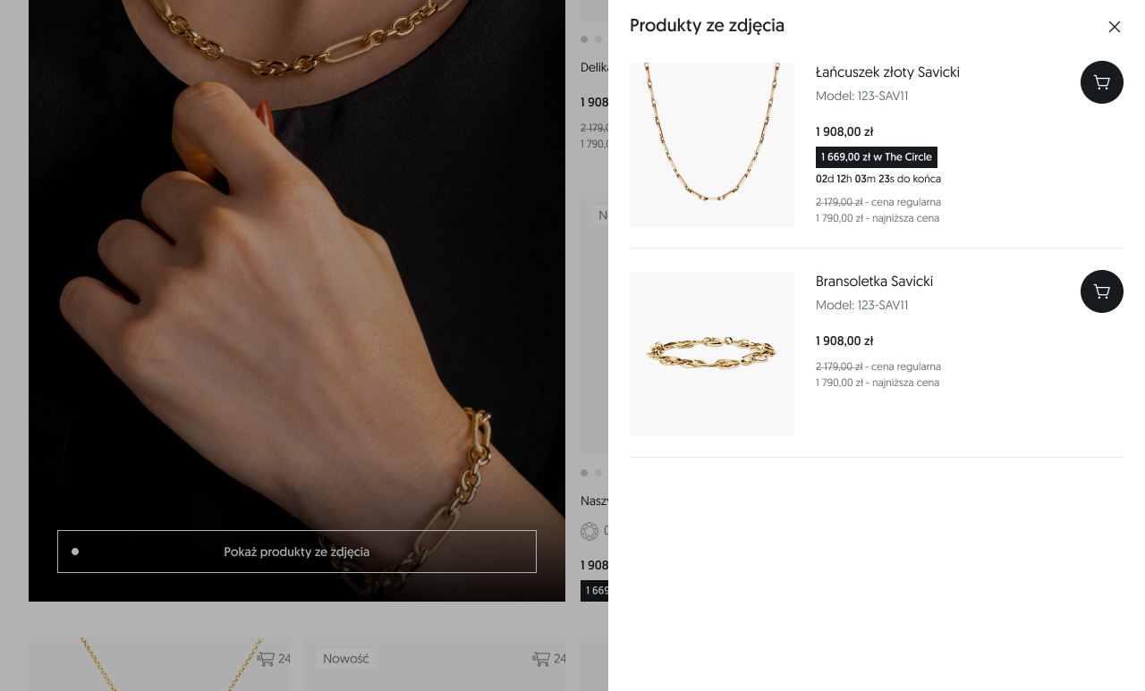
Brand visual inspiration: 1. On desktop: shop the look images with product hotspots throughout the listing on desktop with thumbnail previews on hover 2. On mobile & tablet: shop the look images with call to action, opening bottomsheet with products from inspirational photo.
Other features: 1. Pagination replaced by a “Load more” button with scroll position preserved in the URL. 2. Multiple layout variants tested during A/B sessions.
BEFORE REDESIGN
Before redesign (desktop)
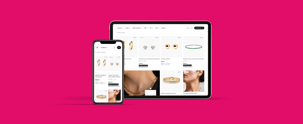
AFTER REDESIGN
Jewelry listing (desktop)
Off-canvas: Physical store (desktop)
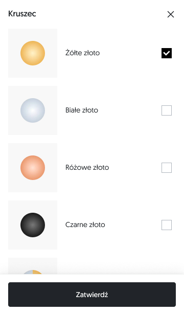
Off-canvas: Metal type (desktop)
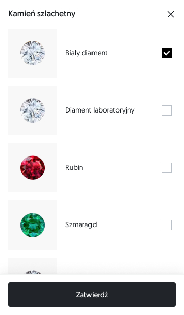
Off-canvas: Stone (desktop)
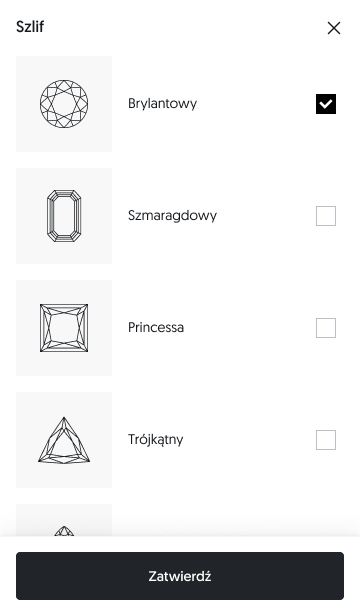
Off-canvas: Cut (desktop)
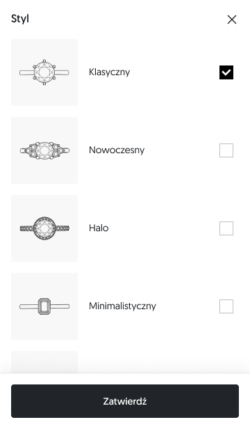
Off-canvas: Style (desktop)
Off-canvas: Price (desktop)
Off-canvas: Collection (desktop)
Off-canvas: Sort (desktop)
off-canvas: Filter (desktop)
Jewelry listing (tablet)
off-canvas: Shop the look (tablet)
Bottomsheet: Physical store (mobile)
Bottomsheet: Metal type (mobile)
Bottomsheet: Stone (mobile)
Bottomsheet: Cut (mobile)
Bottomsheet: Style (mobile)
Bottomsheet: Price (mobile)
Bottomsheet: Collection (mobile)
Bottomsheet: Sort (mobile)
Bottomsheet: All filters (mobile)
Bottomsheet: Shop the look (mobile)
Jewelry listing, condensed for presentation (grid view, mobile)
Jewelry listing, condensed for presentatio (grid view, mobile)